Yesterday I attended a workshop on visualisation literacy. This was part of dissemination from the Seeing data research project.
I'll skip straight to the "what might you want to use yourself" part, since there is a website http://seeingdata.org/ which includes a section for people to work through, to develop their data visualisation literacy. It includes a "rate these visualisations" subsection http://seeingdata.org/understanding-data-visualisations/rate-these-visualisations/. This presents you with some real examples of data visualisations, and then asks you to decide whether you "Disliked it but learnt something", "Disliked it and didn't learn anything", "Liked it and learnt something" or "Liked it but didn't learn anything" and then drag and drop them onto a grid. In the workshop, we first of all examined visualisations and were told to place paper copies of the visualisation on the relevant quadrant of a paper copy of the grid. After this we had to stand up and stand in the relevant quadrant (e.g. "Disliked but learnt something") of a giant grid pencilled on the floor. We were then asked to say why we'd gone into that quadrant. If you have the space, this is something you could do in an information literacy class (using either the examples on the site, or your own examples).
Another exercise involved looking, in small groups, at a data set and proposing different ways to "tell the story" or "answer a question" through a particular kind of chart. As a final exercise we were asked to think of the elements that affected our engagement with a data visualisation e.g. subject matter, source, beliefs, emotions, confidence and the amount of time you have to devote to engaging with the visualisation.
There is some good material in the Understanding Data Visualisation part of the Seeing Data website. For example, one of the speakers took us through some of the different chart types listed on this page http://seeingdata.org/sections/inside-the-chart/: if you click on a chart type it gives some summarised information on "What it shows", "How to read it" and "What to beware". Another section defines 10 key terms i.e. Format, Chart type, Dataset, ata source, Axis, Scale, Legend, Variables, Outliers and Input area.
Helen Kennedy (Professor of Digital Society at the Department of Sociological Studies, University of Sheffield) is the project director, with Andy Kirk ("a UK-based freelance data visualisation specialist" (he has got a useful site, http://visualisingdata.com, which lists loads of data visualisation tools), Rosemary Lucy Hill (a post-doctoral research fellow at the University of Leeds) and Will Allen (a researcher at The Migration Observatory based at the University of Oxford). The project is funded by the AHRC and their twitter stream is https://twitter.com/seeing_data
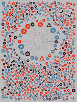
Picture: Mario Klingemann's Dada Visualization I, used under Creative Commons license: original at https://flic.kr/p/6W1ewA (do go there and read the notes about the picture, I think they are amusing)

No comments:
Post a Comment